
PART ONE
Introduction
It’s hard to believe that it’s been 12 years since Jobs unveiled the original iPad on stage, back in 2010. What’s even harder to believe is that over these twelve years, Apple has never shipped a native, first-party calculator app with the iPad. As strange as it may sound, Apple has been selling a best-selling computing device which in its stock form cannot be used to, well, compute.

In a 2020 interview with MKBHD, Craig Frederighi (Senior VP — Software Engineering at Apple) provided what was perhaps the first “official” statement by the company on this peculiarity (summarised)
"While it is easy to build a scaled-up calculator app, we haven’t gotten around to building
a truly great iPad calculator app"
Rewatching this MKBHD interview in 2022, I asked myself, what would a great calculator app for the iPad look like? This project is my attempt at finding an answer to this question using the Design Thinking Framework.
PART TWO
Empathising with Users
iPads are immensely versatile devices. With a slew of capable accessories such as the Apple Pencil and smart keyboards, the iPad's user base spans school children, college students, working professionals, and the aged. With such a diverse user base, it becomes essential to design an app that meets the needs of all, without stepping on anyone's foot. Based on these considerations, I have attempted to put together 2 personas of iPad users:

PART THREE
Defining the Problems
While thousands of calculator apps exist for the iPad on the App Store, a common string of issues runs across all of them.
Pain Points with iPad Calculator Apps
1
Most calculator apps for the iPad are just scaled-up versions of the stock iPhone calculator app with bigger buttons and limited functionality.
3
The apps which offer added features often present these in a convoluted layout offering all users too many choices.
5
Apple's iPhone calculator app uses an unusual input sequence of operators and operands where the operands are inputted before the operators.
2
These apps often require in-app-purchases to remove advertisements and unlock all features, leading to a poor user experience.
4
Third-party apps often lag in aesthetic appeal and don't blend well with Apple's design guidelines.
6
Most importantly, these apps don't leverage any of the iPad's unique capabilities such as the Apple Pencil, split-screen, AR support with LiDAR etc.

PART FOUR
Ideating the Solutions
Keeping in mind the different types of iPad users, I have attempted to design an app with the following features:
Features
1
Basic calculation for all users irrespective of use case.
3
An input logic that is similar to how humans write and comprehend mathematics.
5
A graphing calculator that leverages the iPad's massive canvas and can be used by students and teachers.
2
Advanced calculation for students and academicians.
4
Calculation history that is synced across all your iCloud devices.
6
Apple Pencil scribble support for making handwritten-intuitive calculations without needing to tap buttons.
Design Considerations
1
The app should follow Apple's design guidelines and be cohesive in terms of visual look-and-feel with other Apple apps.
3
Any new functionalities added should not intimidate users who don't need them.
5
The app should scale well across full-screen, split-screen and slideover.
2
Given the large screen size of the iPad (up to 12.9"), reachability becomes an important factor to consider.
4
Apple pencil input process should feel intuitive. As Apple puts it "Like putting a physical pencil on paper".
Low Fidelity Sketches
Since this was my first time designing an interface for a device as large as the iPad, I felt the need to sketch out my ideas on paper first, laying out the elements, and figuring out the flows.

PART FIVE
Designing Prototypes
I used Figma to demonstrate my vision for what this app could be. Throughout the designing process, I have attempted to work efficiently by employing components, interactive components and using auto-layout.
"What's New" Welcome Screen

To introduce the new capabilities of the iPad calculator app, a “What’s New” welcome overlay pops up when the user launches the app for the first time.
Basic Calculator Interface
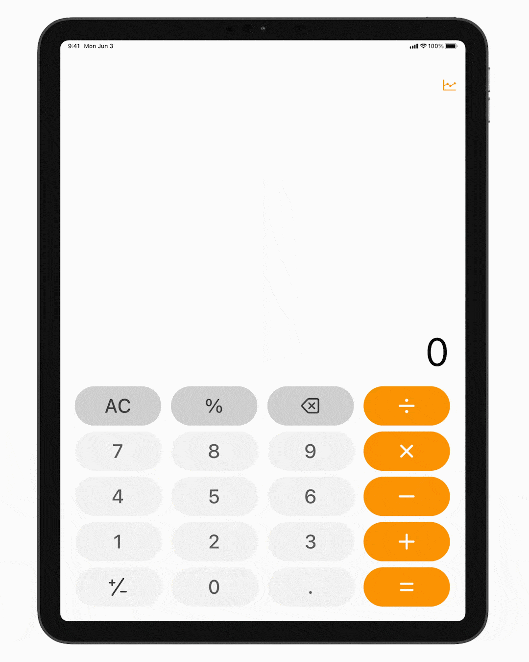
The fundamental calculator app interface is a natural adaptation of the iPhone's native calculator app.
The buttons have been enlarged but still span less than 50% of the vertical space available, providing easy reachability.
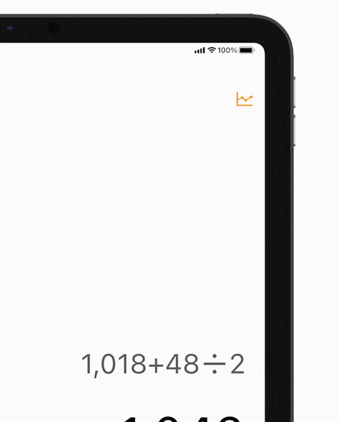
Users enter the entire calculation they wish to perform at one go. The input sequence of operators & operands is similar to how humans write math.
Pressing "=" keeps the question visible albeit with lesser prominence for context.

Flipping the iPad over to its landscape orientation opens up the advanced calculation interface, a gesture familiar to seasoned iPhone users.
Calculation History

Swiping down with your finger anywhere above the keys pulls down the history sheet of calculations.
This history is synced across all your iCloud devices for a smooth handoff.
Results can be copied and pasted from the history sheet.
Scribble Mode
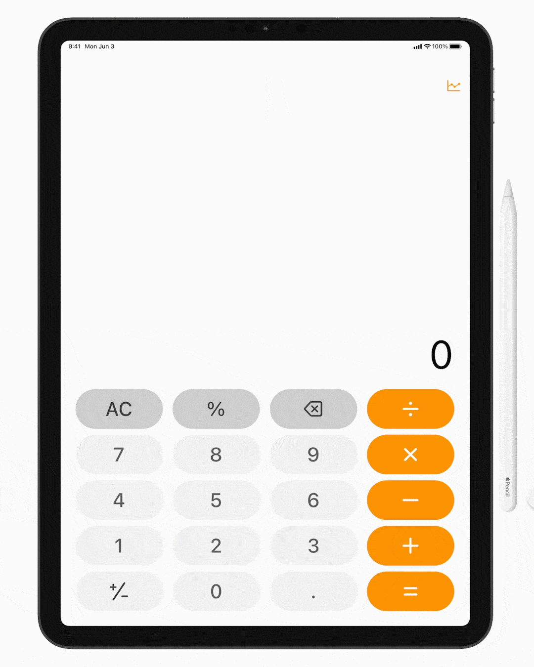
Touching a blank area with the Apple Pencil activates scribble mode.
Users can scribble the calculation they wish to perform and the iPad transcribes it into alphanumeric data.
While users can begin scribbling in any place, after they finish, their input is relocated to a dedicated zone for each calculation.

A floating widget similar to the Apple Notes app holds a pen and an eraser allowing users to edit part of their scribbled input.
2nd Generation Apple Pencil users can also toggle between the pen and eraser with a double-tap on the pencil's button.
2D Graph Mode
Tapping the graph button at the top right switches to graph mode.
This toggle button is intentionally kept at the top so that unwitting users don't toggle the mode by mistake while doing calculations.
A micro-interaction switches the graph icon to the calculator icon, indicating that users can go back to calculator mode by tapping it again.
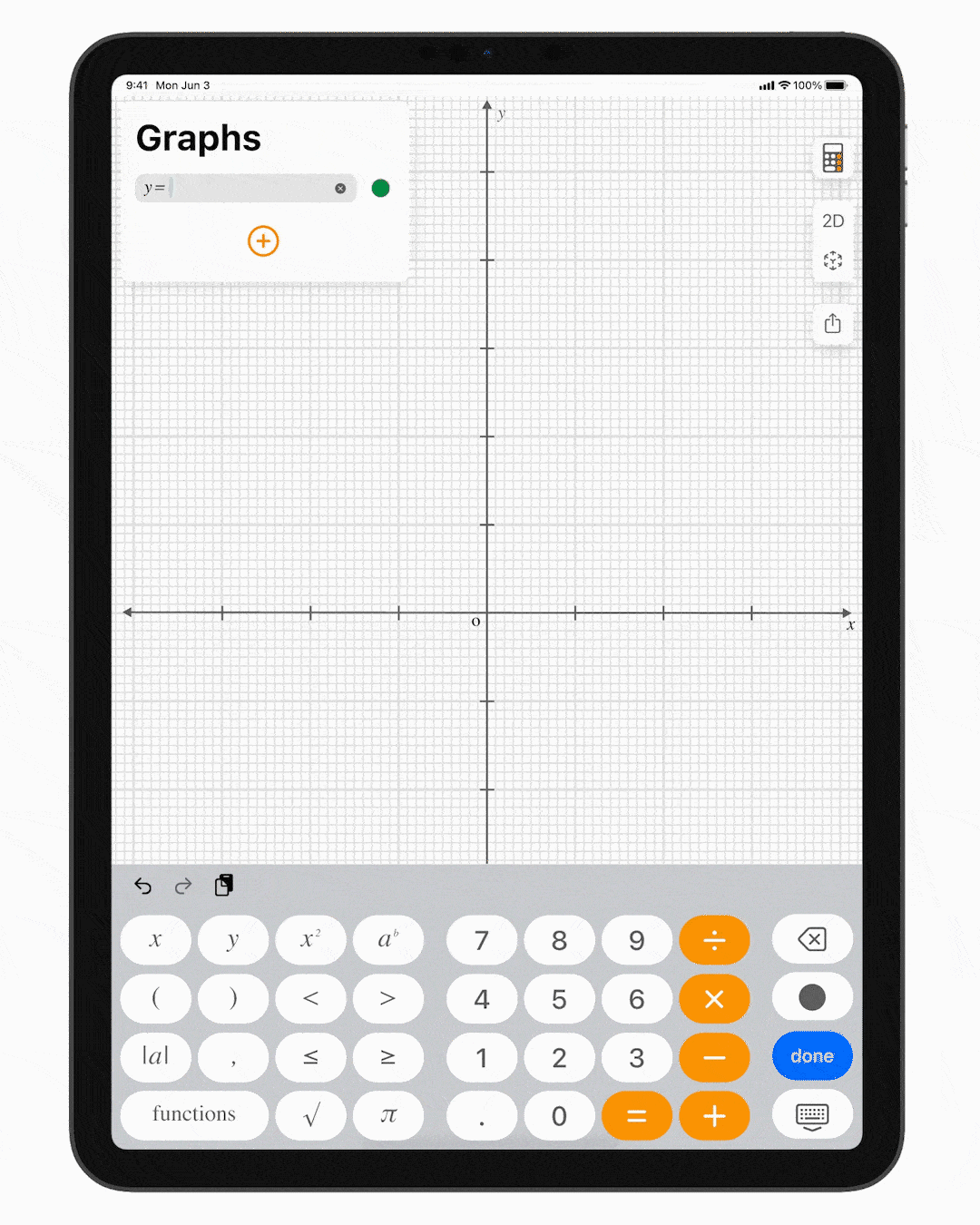
The graph mode keyboard adds additional buttons relevant for plotting graphs along with special functions.
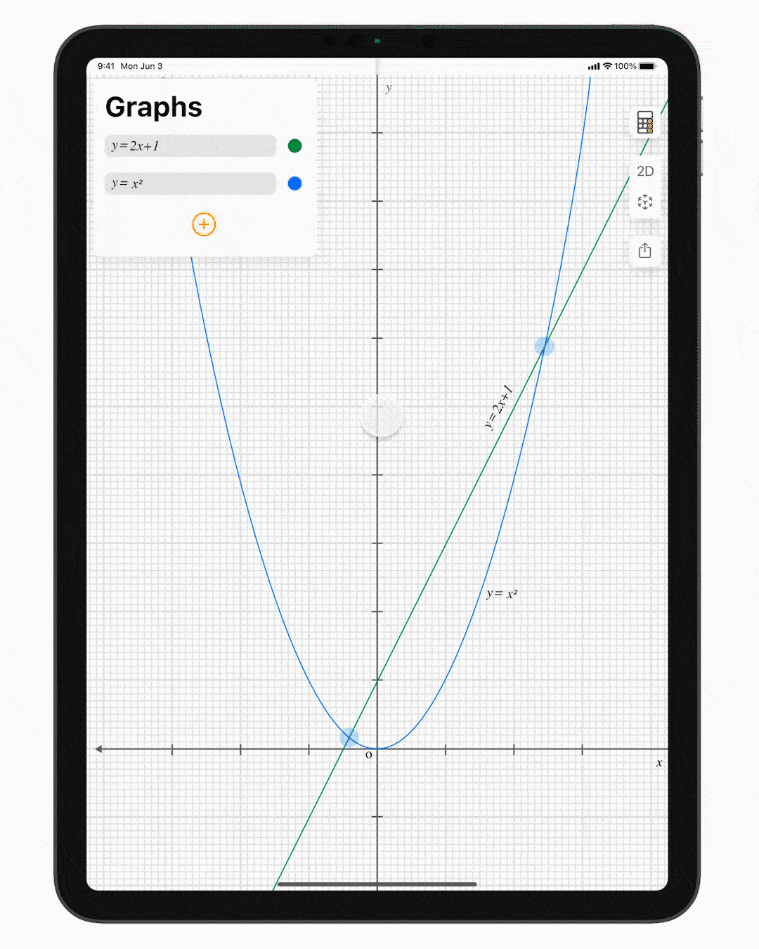
Points of interest such as intersection points, maxima, minima are highlighted and can be tapped for coordinates.

The Apple pencil acts as an annotating tool in graph mode.
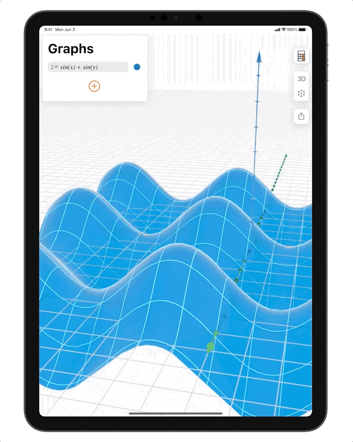
3D Graph Mode

Switching to 3D mode allows users to visualise complex functions that are difficult to plot manually.
AR Graph Mode
Viewing graphs in augmented reality enables more facile visualisation of concepts such as local and global maxima/minima, topography etc.
Multitasking
Support for iPad's multitasking frameworksx such as split-screen and slideover.

